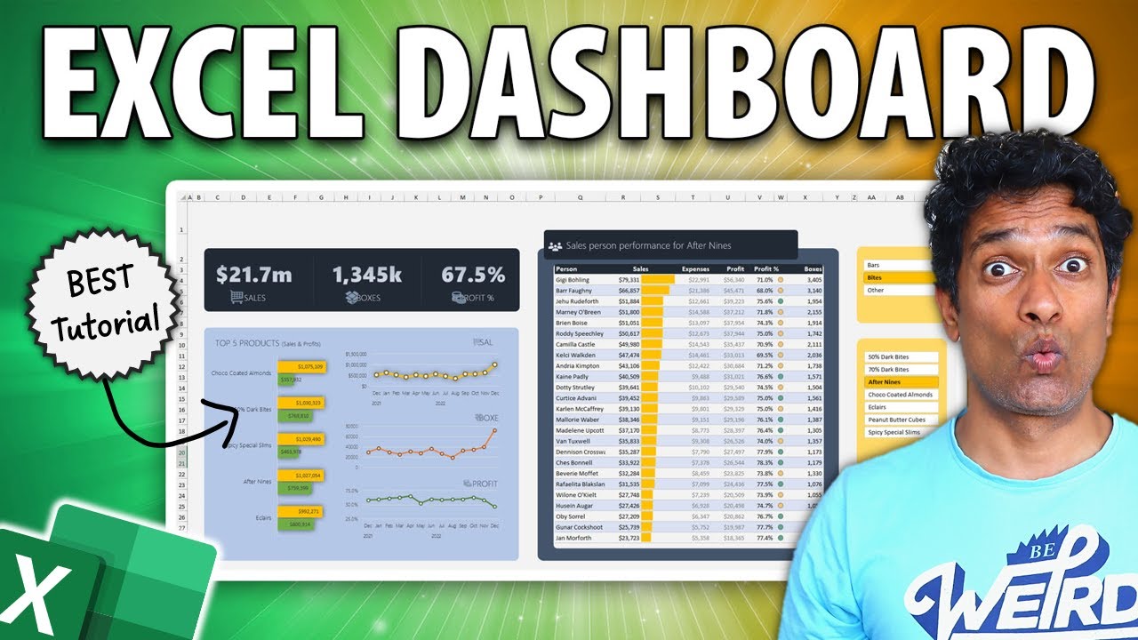
Dashboards are a highly sought after skill in business analytics. In this comprehensive and detailed video, learn how to create a beautiful & functional business KPI (metric) dashboard using Microsoft Excel in less than 30 minutes.
Prior skills needed:
Basic familiarity with Excel (watch this tutorial: [ Ссылка ] )
How to create a pivot table (watch this tutorial: [ Ссылка ] )
How to create slicers (watch this tutorial: [ Ссылка ] )
📁 Sample Files:
Please download the blank data & outline file here:
[ Ссылка ]
💥 Download completed workbook:
The full dashboard is now part of my Excel School Dashboards program. If you join the course, you will unlock this + 50 more Excel workbooks and 32+hours of videos on all things Excel.
Visit [ Ссылка ] to sign up.
📈📊 More Videos on Dashboards:
Project Dashboard with Excel - [ Ссылка ]
Website Metrics Dashboard with Excel - [ Ссылка ]
Beautiful Sales Dashboard with Excel - [ Ссылка ]
HR Dashboard with Excel - [ Ссылка ]
Dashboards Playlist - [ Ссылка ]
~
Video Timestamps:
================
0:00 - Introduction to the Dynamic Business Dashboard
1:07 - The Blank Data File & our data
1:52 - How to design the dashboard?
3:50 - Setting up the Pivot Tables & DAX
7:35 - Preparing the Dashboard
10:40 - Adding the Bar chart with Top 5 Products
15:01 - Adding the trends
19:22 - Sales Person Table Report
23:48 - Adding conditional formats
25:00 - Tidying up the formatting
26:46 - More things you can add
~
#excel #dashboard


![Гелертер верят - Развитая цивилизация существовала до появления людей? [Времени не существует]](http://i.ytimg.com/vi/pMxzC99_ZkE/mqdefault.jpg)


![ЧТО БУДЕТ, КОГДА НИЧЕГО НЕ БУДЕТ? [Больцмановский мозг]](https://i.ytimg.com/vi/dBu-dOuKsFs/mqdefault.jpg)