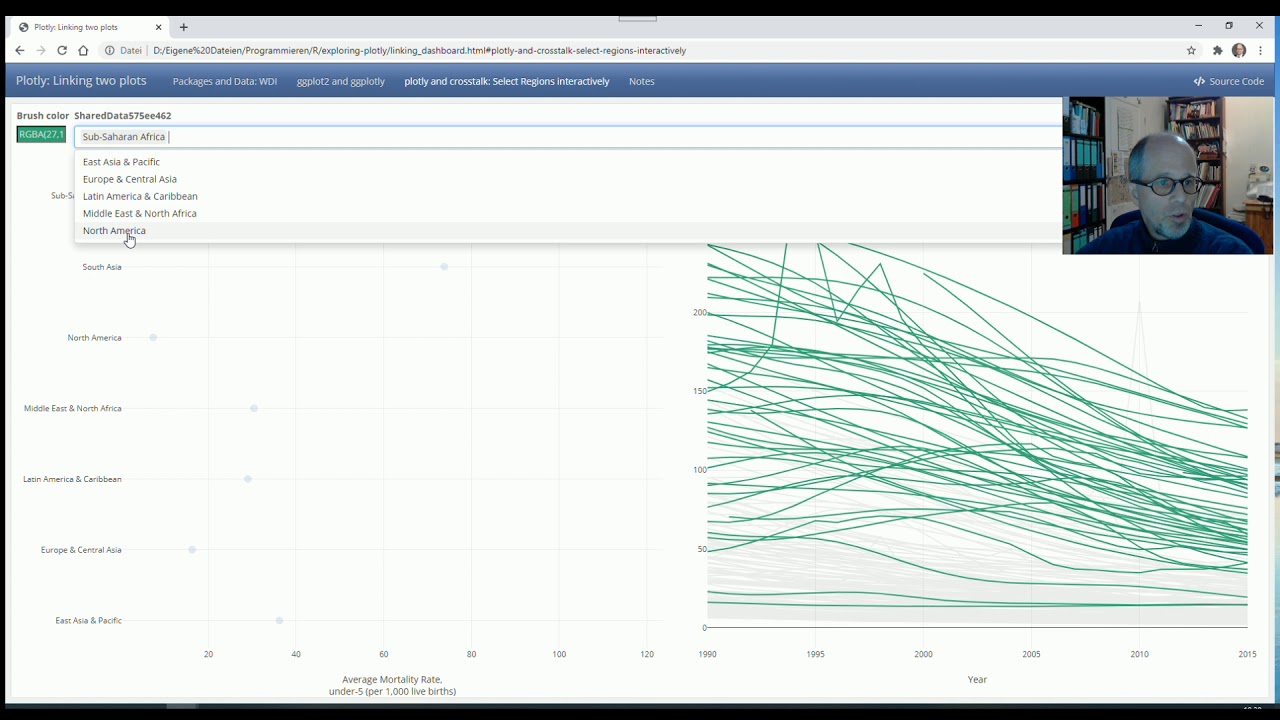
Until quite recently, I only used the great plotly R package (shout out to Carson Sievert) via the ggplotly() function. But plotly offers so much more! Here, we link two interactive plots so that you can select groups from a summary plot which are then automagically highlighted in a more detailed adjacent plot. This is an elegant way of visually exploring data, and you don't even need Shiny to achieve that. The resulting file (here: a dashboard via the flexdashboard package) comes in HTML format, the interactive elements are powered by JavaScript. So you can share this file with colleagues who don't have R installed, or upload it on a website without needing R running on the server, as opposed to Shiny apps.
The data is taken from the World Bank, accessed via the WDI R package.
R Code: [ Ссылка ]
Contact me, e. g. to discuss (online) R workshops / trainings / webinars:
LinkedIn: [ Ссылка ]
Twitter: [ Ссылка ]
Xing: [ Ссылка ]
Facebook: [ Ссылка ]
[ Ссылка ]
R Workshops: [ Ссылка ]
Blog (German, translate option): [ Ссылка ]
Playlist: Music chart history
[ Ссылка ]