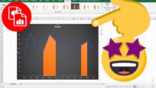
You create a line chart and want to mark some areas of significance. Maybe the line chart showed sales and there are some area where there was a market downturn so it could help explain why the sales were impacted in those months. You may have seen this type of chart where it tracks the Dow Jones Average and there is somewhat of a shaded area that shows the months where there was a recession. This chart is not exactly like that but it is similar. And it's easy to create, so check out the video to learn how.
🔔 SUBSCRIBE to my channel ➜ [ Ссылка ]
🏫 Excel Training ➜ [ Ссылка ]
📚 Excel Books & Tech Gear ➜ [ Ссылка ]
⚙️ Tools: Screencasting ➜ [ Ссылка ]
⚙️ Tools: Microsoft Office ➜ [ Ссылка ]
⚙️ Tools: TubeBuddy ➜ [ Ссылка ]
📝 This description may contain affiliate links and we'll receive a small commission if a purchased is made using the links (but at no additional cost to you). It'll support the channel and so more videos like this can be made. Thanks for your support!
🎁 If you find these videos useful and want to support my channel go to [ Ссылка ]
#excel
#msexcel
#doughexcel
-~-~~-~~~-~~-~-
Please watch: "Convert Table in a PDF File to Excel"
[ Ссылка ]
-~-~~-~~~-~~-~-
Highlight Parts of a Line Chart
Теги
line chart in exceltracktrickscharting tricks in exceltrendtoexcel charts101kpi charts in excelexcel tips and tricksrecessionexcel youtube channelbasicdow jonesdynamic line chartlearn excelsimplewindowstipsdoughtutorialmicrosofthow totrainingcolumn targetlearneasyhowmsofficehow-tohighlightline chartexcelpower query