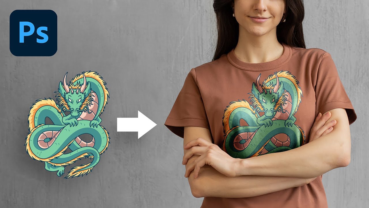
Discover the most natural way to place a design or a graphic on any surface with Photoshop, and guess what, it is not "Blend If"! In this lesson, we will use Luminosity Masks & Channels to create a much more realistic look by layering our design in both highlights and shadows. Right from adding multiple shades of dimension to essential techniques to get the best colors, we will cover it all.
We will also talk about why "Blend If" might not be the right choice and learn advanced techniques to add natural shine and depth. I hope this tutorial helps you. Thank you so much for watching :)
► Support the Channel & Gain Premium Access: [ Ссылка ]
► Timestamps
00:00 What About Blend If?
00:50 Placement and Moulding
05:17 The Problem with Blend If
07:46 Working the Shadows
10:17 Watch Out! A Major Color Issue
11:30 Working the Highlights
12:06 Adding Definition Using Multiple Copies
14:06 Design Looking Dull?
14:34 Masking
15:45 Recap
16:46 A Twist & Surprise!
18:15 Thank You!
► Recommended Software & Gear:
✅ My Graphic Tablet: [ Ссылка ]
✅ Recommended Budget Tablet: [ Ссылка ]
✅ Try Photoshop for Free: [ Ссылка ]
✅ Artificial Intelligence Photo Editor: [ Ссылка ]
✅ Unlimited Photoshop Actions, Plugins, and Stock Photos: [ Ссылка ]
✅ Best 300+ High-Quality 50MP Skies for Sky Replacement: [ Ссылка ]
✅ Primary Microphone: [ Ссылка ]
✅ Second Microphone: [ Ссылка ]
✅ Audio Interface: [ Ссылка ]
✅ Filmed with: [ Ссылка ]
✅ Lens: [ Ссылка ]
✅ Music: [ Ссылка ]
✅ The App I Use for YouTube Growth: [ Ссылка ]
► PiXimperfect Merch Store:
[ Ссылка ]
► PiXimperfect Actions:
[ Ссылка ]
► Downloads:
1. Sample Image: [ Ссылка ]
2. Dragon Illustration: [ Ссылка ]
2. Finished PSD: [ Ссылка ] (Only for our Patreon Family)
► Share: [ Ссылка ]
► Let's Connect:
Instagram: [ Ссылка ]
Facebook: [ Ссылка ]
Twitter: [ Ссылка ]