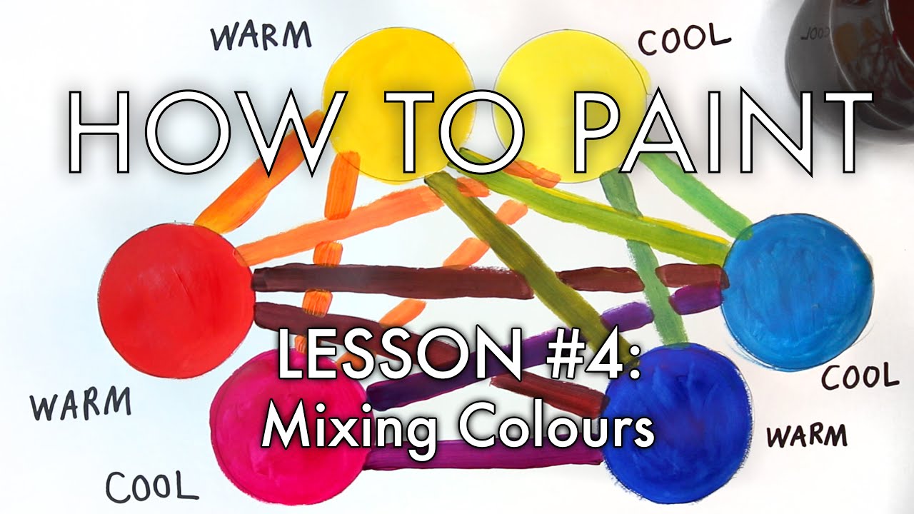
In the fourth episode of artist Michael Markowsky's "How to Paint" series, he demonstrates how choosing the right "primary" colours for your palette will radically improve the quality and saturation of the "secondary" colours that you get as a result when you mix them them together. Video shot on February 10th and edited by Michael Markowsky on February 24-29, 2016.
The paints I use in this video are:
Cerulean Blue - COOL
Ultramarine Blue - WARM
Quinacridone Magenta - COOL
Cadmium Red Medium Hue - WARM
Cadmium Yellow Light Hue - COOL
Cadmium Yellow Medium Hue - WARM
Please watch all of the videos in my "How to Paint" series!
1) Introduction to The Artist's Colour Wheel: [ Ссылка ]
2) Value (Modifying Colours with Tints, Tones, Shades): [ Ссылка ]
3) The Secrets of Colour Temperature (Warm and Cool Colours): [ Ссылка ]
4) The BEST Color Mixing Tutorial EVER: [ Ссылка ]
5) Paint Van Gogh's "Sunflowers": [ Ссылка ]
6) Paint Edvard Munch's "The Scream": [ Ссылка ]
To see more of Michael Markowsky's art, please visit:
– Website: [ Ссылка ]
– Instagram: [ Ссылка ]
– Facebook: [ Ссылка ]
– Twitter: [ Ссылка ]
– YouTube: [ Ссылка ]
“Poppies and Horses” by Learning Music is licensed under a Creative Commons Attribution License.
[ Ссылка ]
[ Ссылка ]


![Sen to Chihiro no Kamikakushi [Аниме клип]—Хаку и Тихеро](https://i.ytimg.com/vi/E0ixZ-RHgTY/mqdefault.jpg)


![Винкс Клуб - Винкс Клуб - Сезон 1 Серии 7 - 8 - 9 [ПОЛНЫЕ СЕРИИ]](https://i.ytimg.com/vi/izO-EYTm0Bc/mqdefault.jpg)


