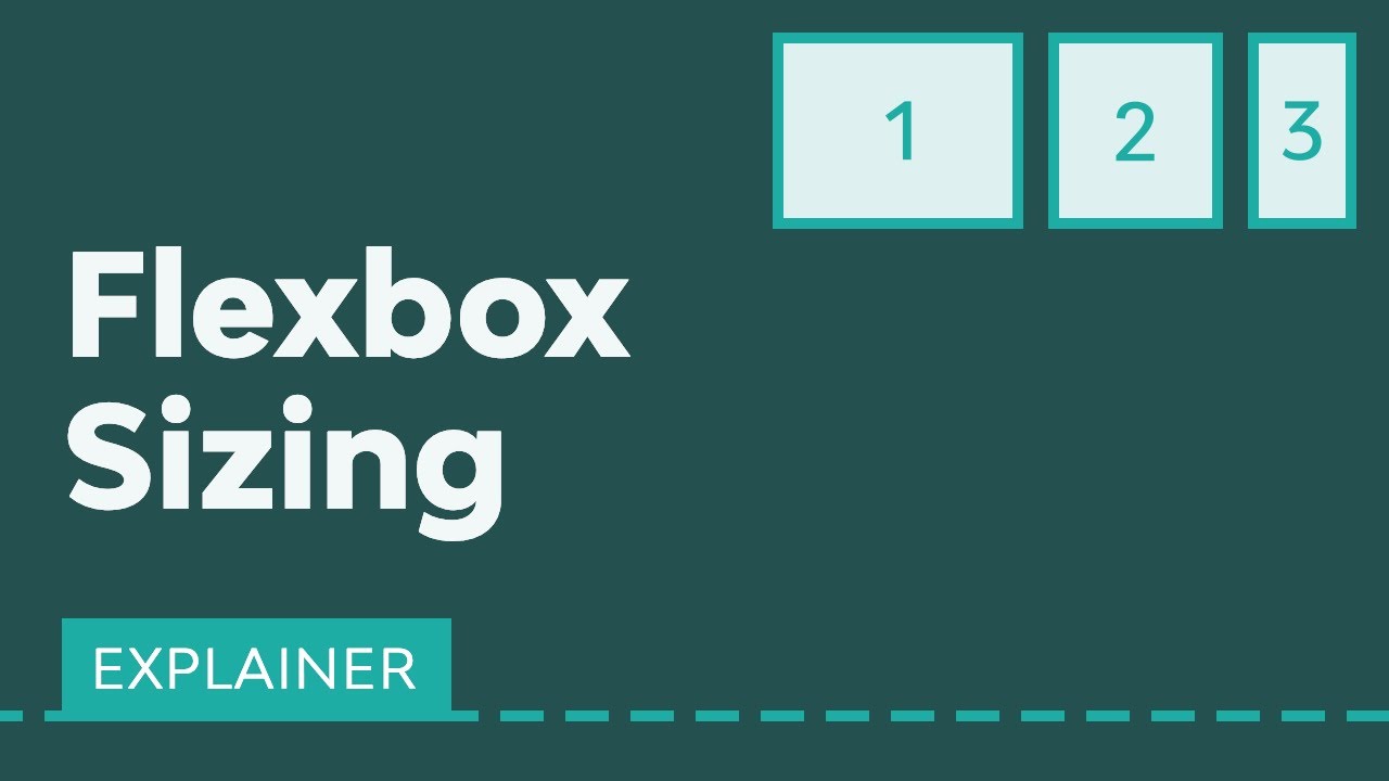
Flexbox sizing makes it possible to create flexible layouts that fully adapt to the screen. Learn everything you need to know about flexbox sizing in this video. ► Download Unlimited Stock Photos, Fonts & Templates with Envato Elements: [ Ссылка ]
If you set up everything correctly using flexbox, you won’t have to rely on media queries to support different viewports, layouts, and orientations.
In this guide, Adi Purdila will show you how to use the following flexbox sizing properties:
• flex-grow
• flex-shrink
• flex-basis
• flex
Next, watch this video to learn about flexbox alignment: [ Ссылка ]
And this one for flexbox ordering: [ Ссылка ]
Read the written version of this flexbox sizing guide on Envato Tuts+: [ Ссылка ]
- - - - - - - - - - - - - - - - - - - - - - - - - - - - - - - - - - - - - - -
Envato Tuts+
Discover free how-to tutorials and online courses. Design a logo, create a website, build an app, or learn a new skill: [ Ссылка ]
Envato Elements
All the creative assets you need under one subscription. Customize your project by adding unique photos, fonts, graphics, and themes.
► Download Unlimited Stock Photos, Fonts & Templates with Envato Elements: [ Ссылка ]
► Subscribe to Envato Tuts+ on YouTube: [ Ссылка ]
► Follow Envato Tuts+ on Twitter: [ Ссылка ]
► Follow Envato Tuts+ on Facebook: [ Ссылка ]
- - - - - - - - - - - - - - - - - - - - - - - - - - - - - - - - - - - - - - -


![[REST API на Golang #9] Создание и получение списков](http://i.ytimg.com/vi/KpTZuZE5HS8/mqdefault.jpg)