Are you looking to take your Excel skills to the next level? If so, you won't want to miss this in-depth tutorial on creating interactive dashboards. In this video, we'll cover a range of advanced techniques for turning your pivot tables into powerful charts and tables that can be manipulated with just a few clicks.
👉👉👉 DOWNLOAD files used in the presentation: [ Ссылка ] 👈👈👈
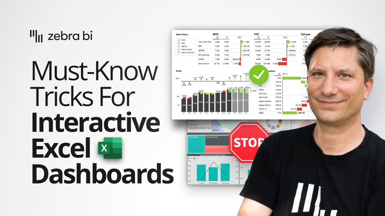
Watch Andrej Lapajne, Zebra BI CEO & Founder, sharing his top tips and tricks for creating interactive dashboards in Excel. Whether you're looking to create advanced charts and tables from pivot tables, or want to add slicers and filters to make your dashboard more engaging, consider yourself covered.
Throughout the video, you'll learn how to change the data source of your visualizations with just a few clicks, and discover some cool formatting tricks to make your dashboards stand out. You'll also explore advanced features like Top N + Others and calculation elements, which can help you get even more insights from your data.
By the end of this tutorial, you'll have a solid understanding of how to create effective and engaging interactive dashboards in Excel, with practical tips and examples from a seasoned pro. So whether you're a business analyst, data scientist, or just looking to level up your Excel skills, this video is a must-watch!
AGENDA
00:00:00 Start
00:00:07 Intro
00:10:18 Creating advanced charts and tables out of pivot tables
00:13:25 Create and add a pivot table to the Home page
00:14:59 Add and customize Zebra BI Tables visual
00:22:21 Adding filters to the dashboard
00:26:26 Synchronize filters across multiple pivot tables
00:33:46 Copy/paste the existing pivot table and change the fields
00:35:47 Add and customize Zebra BI Charts visual
00:39:21 Create more pivot tables and visuals for additional insights
00:42:42 Applying advanced features like Top N + Others
00:43:46 Create a detailed page
00:49:43 Additional customization of the visual, adjust styles, and design
00:51:16 Adding slicers to make the dashboard interactive (+ cool ways to format them)
01:01:22 How to add navigation buttons with links to other pages
01:04:06 Wrap up
🙌🙌🙌 Thank you for watching this video, part of our "Must-Know Tricks For Interactive Excel Dashboards in 2023" webinar. We hope you found it informative and engaging. Watch the whole webinar here: ADD URL
👋 With Zebra BI you can transform your Excel reports into professional, interactive visualizations that tell a story. And the best part? You don't need advanced BI skills to get started.
👉👉👉 Try Zebra BI for Office for free today and see just how simple it is to create charts that get results: [ Ссылка ] 👈👈👈
ABOUT OUR CHANNEL
Our channel is all about Actionable Reporting and has one goal: to enable everyone to create better reports. We cover Power BI, Excel, and PowerPoint reporting, business intelligence, business analytics, data storytelling, and related topics.
Check out our channel here:
[ Ссылка ]
Don’t forget to subscribe!
CHECK OUT OUR OTHER VIDEOS
[ Ссылка ]
[ Ссылка ]
[ Ссылка ]
We make these awesome data visualization tools, check them out here:
[ Ссылка ]
[ Ссылка ]
[ Ссылка ]
FIND US AT
[ Ссылка ]
GET IN TOUCH
Contact us on info@zebrabi.com
FOLLOW US ON SOCIAL
Get updates & reach out on our Social Media Profiles!
Twitter: [ Ссылка ]
Facebook: [ Ссылка ]
LinkedIn: [ Ссылка ]